PolicyLab at CHOP Identity
BACKGROUND
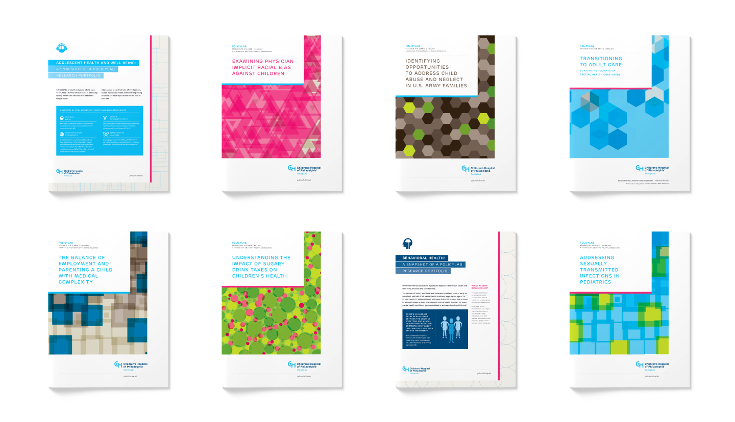
Once the new brand guidelines were released, we were tasked with updating PolicyLab’s materials to fit within the CHOP guidelines while also finding ways to make the materials look specific to PolicyLab.
To do this, we focused heavily on the areas in the brand guidelines where there was the most room for expansion and interpretation of the rules: patterns and icons. Everything else, from the primary color palette to typefaces to publication spacing were required to stick to the finalized CHOP brand guidelines.
(Work done at Untuck with John & Amy Saal)
Untuck began working with PolicyLab when CHOP (Children’s Hospital of Philadelphia) was on the cusp of releasing an updated brand identity.
We first associated each of the PolicyLab research areas with a color from the CHOP parent brand color palette.
We then expanded upon this palette to include a range of tints and shades from the primary colors to fully build out the palette.
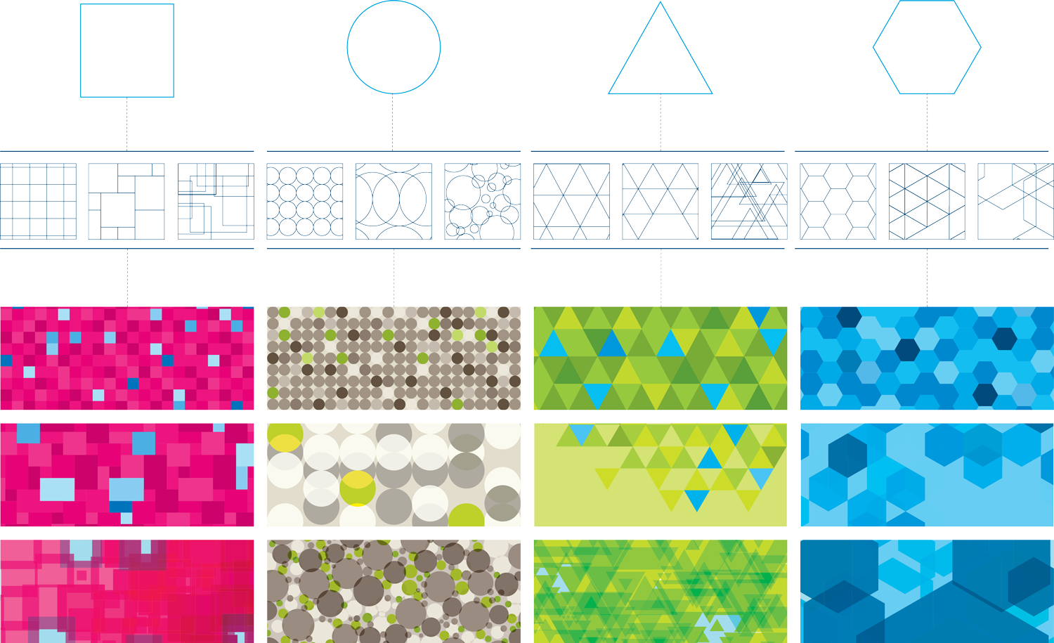
Once we had the expanded color palette nailed down, we used four basic shapes—square, circle, triangle and hexagon—to build a base library of abstract patterns.
We created three patterns for each shape, ranging from organized to playful, which was our interpretation of CHOP’s mandate that patterns represent a spectrum of metaphors from scientific to childlike. Once both the palettes and patterns were created, we applied color to all of the patterns, using a primary color (representative of the research area) and a secondary accent color from the palette. All of the pattern and color combinations allowed us to create a library of 100+ patterns that PolicyLab could use across their materials to keep things fresh and uniquely their own while remaining within the CHOP parent brand.
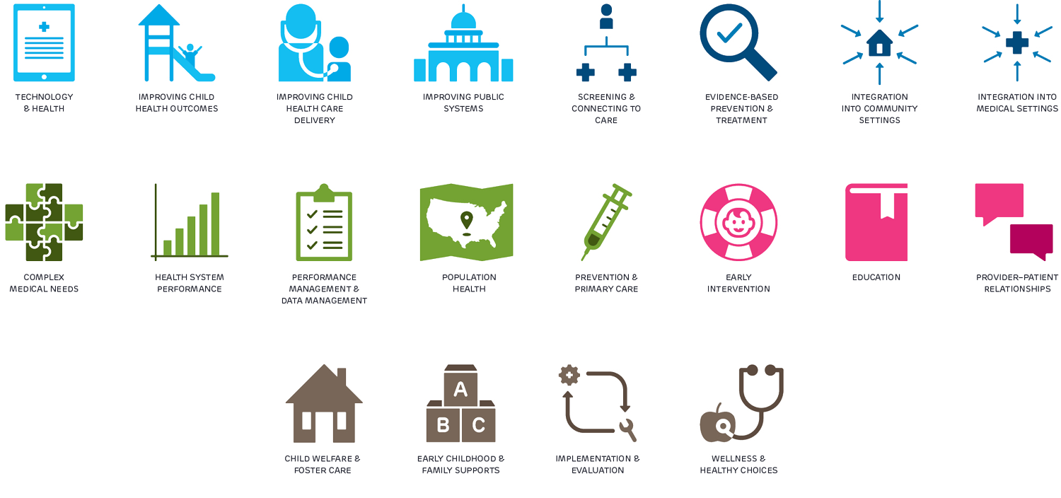
Additionally, we updated PolicyLab’s existing icon library.
Not only did we want to make sure that the colors aligned with the palette updates and research area color associations, we wanted to make sure that the icons were designed in a consistent manner—utilizing the same dimensions, line weights, and illustration style. We also rethought some of the icons from the original library that weren’t as clear of a representation as they could be, or were scenes that were too complicated to truly be considered icons and would not scale well.


