University City Science Center Website

BACKGROUND
The University City Science Center has been an incubation powerhouse in the Philadelphia region for nearly 60 years, helping science and technology startups find their footing and their funding.
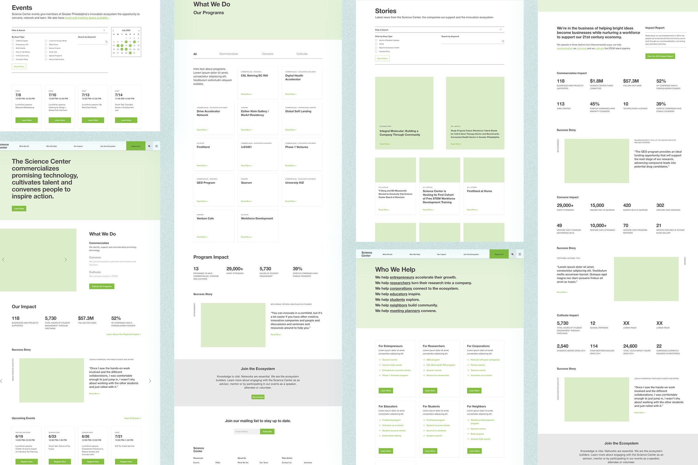
They came to Untuck for a website redesign—their old website wasn’t just ready for a refresh, it was in need of rethinking from the ground up. It had been loaded up and added onto with content that, over the years, had created a labyrinth-like architecture that made it hard for users to find what they needed from the site, hard for them to figure out how they could fit in to the Science Center’s programs, and hard for them to figure out what it was the Science Center even did. We worked closely with Science Center’s leadership and marketing team to define a clear architecture and a content strategy that showcases the breadth and impact of Science Center’s work.
(Work done at Untuck with John & Amy Saal; development by Adam Balée)

In our first all-virtual pandemic workshop, we led the team through a series of exercises to help identify users, organize content, and start building consensus on the visual design language.
From there, we defined the site architecture and created wireframes to work through potential content and user flows hiccups before applying any design framework.
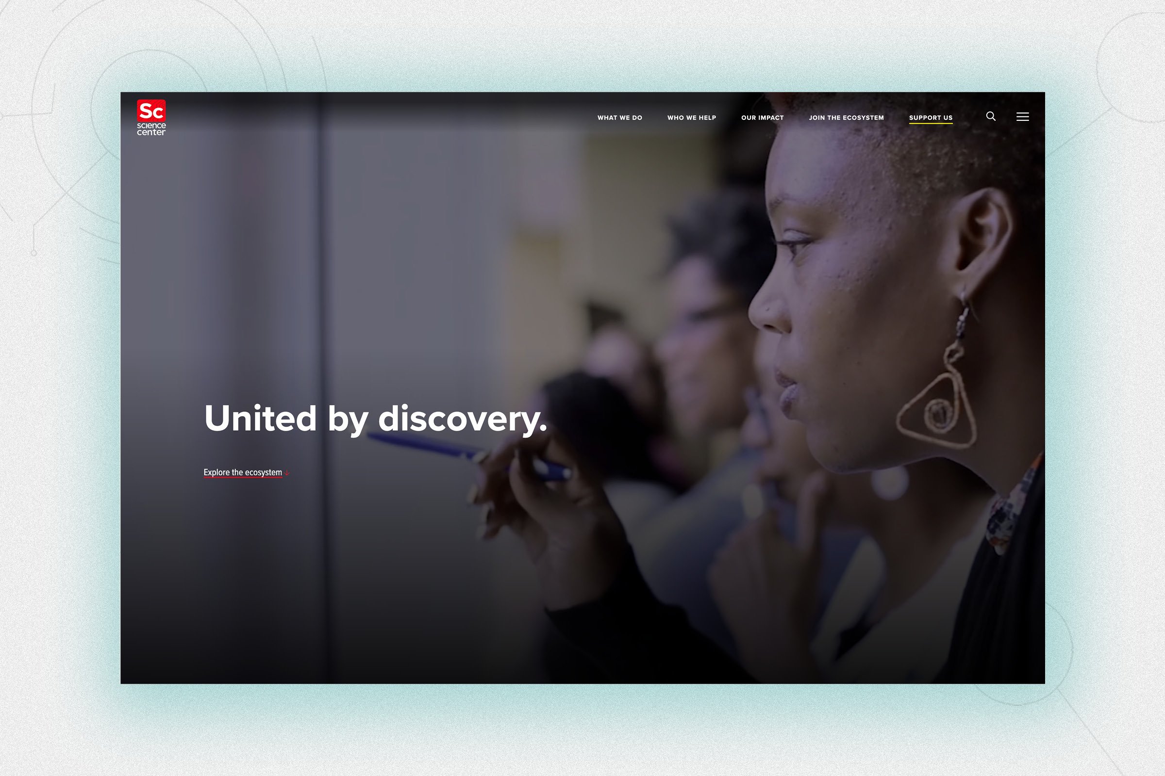
Enter stage left: the Science Center ecosystem.
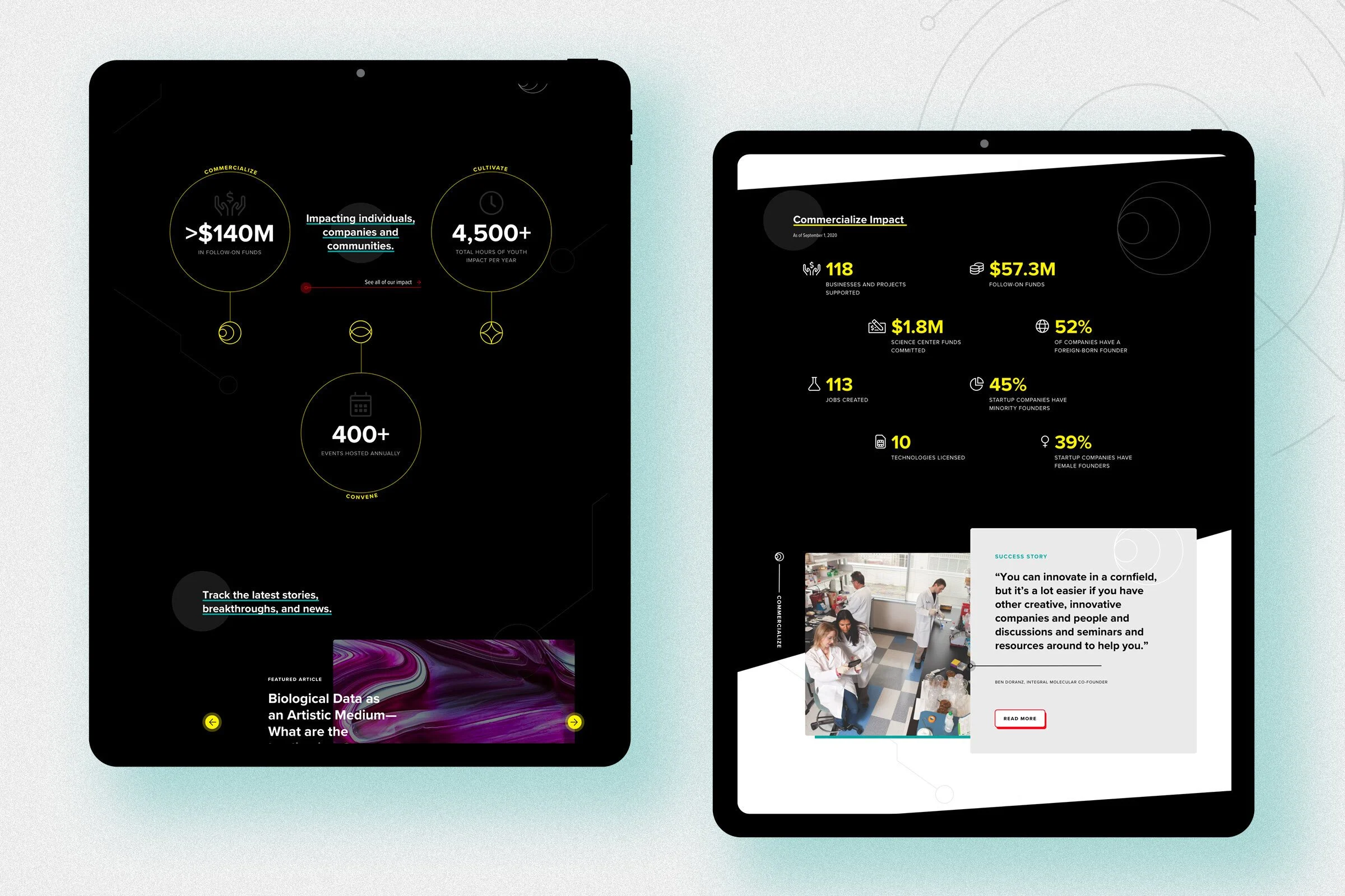
The Science Center had been categorizing their programs by four Cs: commercialize, capital, cultivate, and convene—and we saw this as an opportunity to turn those categories into an ecosystem graphic. This graphic could visually explain what the Science Center does—combining their programs, their community-building efforts, and their partnerships—together into an ecosystem. It could also work as a graphic theme throughout the website, connecting all of the different parts of the Science Center using the same molecular-like linework from their logo to build the graphic elements.


We made sure that the Science Center’s impact was showcased throughout the site by including relevant statistics and success stories from people across the ecosystem.
By including these, our goal was to ensure that we would appeal to both the head and the heart of users—those who were interested in the data, and those who wanted to know how Science Center was achieving their mission.

We leveraged Science Center’s robust content library by creating a beautiful, functional blog and populating related content throughout the site.
We knew based on analytics that the blog was the first touchpoint for many people visiting the site, so making sure that the focus stayed on storytelling by separating out news and press releases (which went into a separate Media Center section) was important.

Community-building is a huge part of the Science Center’s focus, so organizing all of their events from art exhibits to Venture Café gatherings into a streamlined, searchable hub was a must.
We also made sure to highlight their event space, where people can host meetings and workshops of their own.

Buckminster Fuller, who spent time as a Fellow in Residence at the Science Center in the 1970s and 80s, is considered the “patron saint” of the organization, so we wanted to include him in the design.
We thought the perfect way to do so was by using him in a guided search tool we called the Resident Genius, which was designed for specific personas and helps them quickly find what they’re looking for.


Knowing that websites must remain flexible, we wanted to empower the Science Center to feel comfortable using what we’d created for them as building blocks for pages.
In order to ensure understanding and consistency, we documented these elements and content blocks publicly on their website, where anyone can reference and use them.
