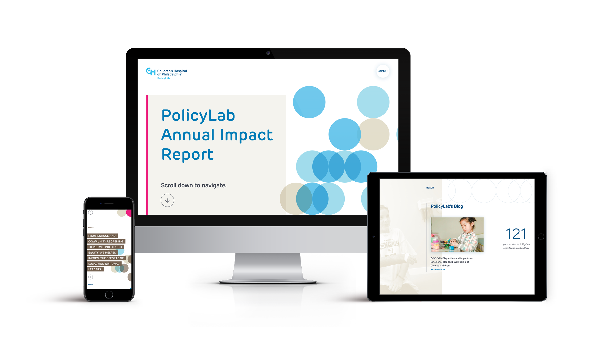
PolicyLab at CHOP Impact Report Website
BACKGROUND
PolicyLab came to us to design a one-page, brand-centric design for an impact report site that would be able to grow and change with their goals and impacts over the course of several years.
They also wanted to be able to use this site as a fundraising piece, explaining to potential donors what PolicyLab does and showing the work that they would be supporting. Our goal was to create a site that highlighted impacts in each clearly delineated section (Research, Policy, Programs, Reach) and to create a design that was editorial in nature, allowing longer featured stories and shorter snippets that would lead readers back to the main PolicyLab site.
(Work done at Untuck with John & Amy Saal; development by Adam Balée)
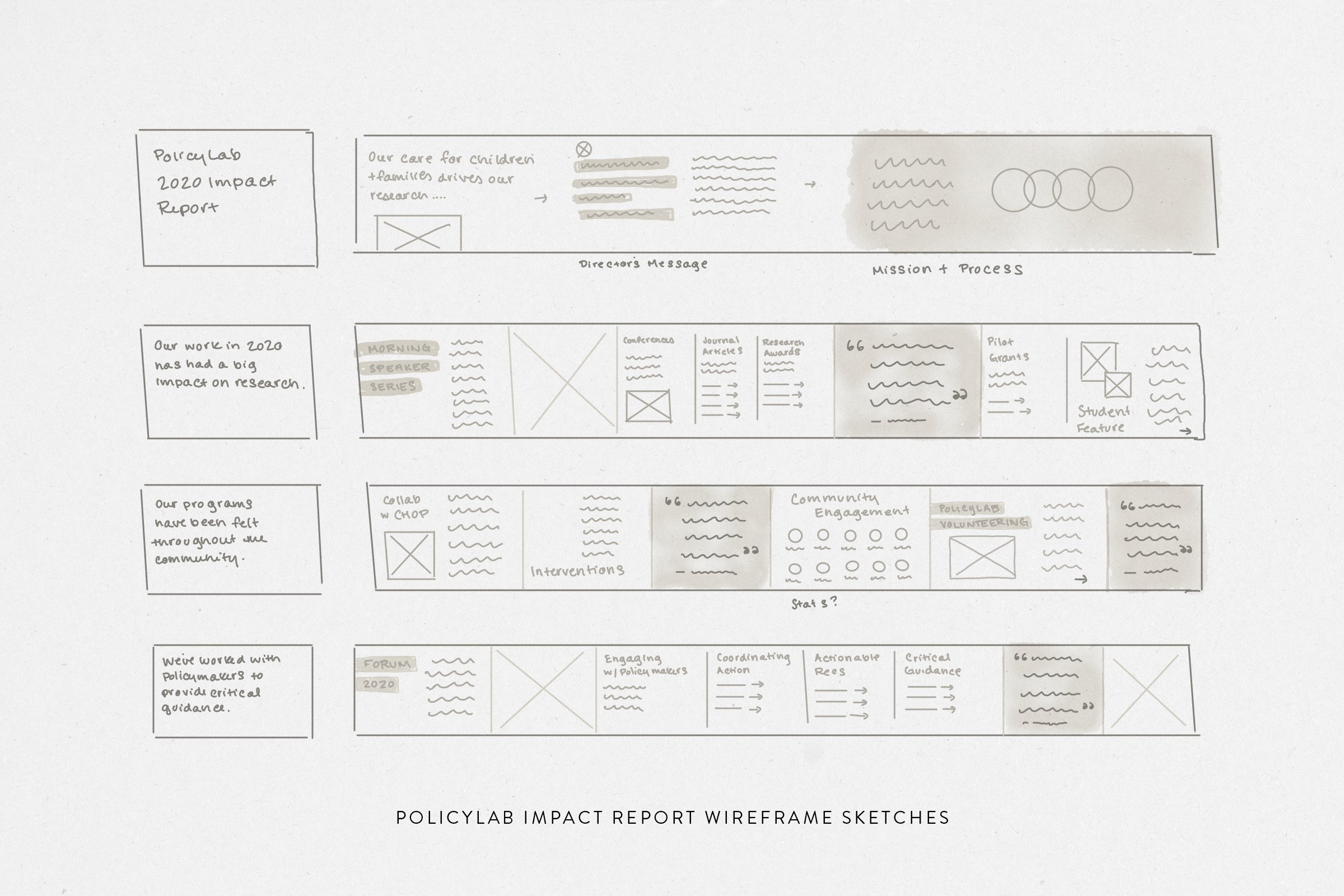
We proposed a horizontal scrolling site, which allowed us to easily create visual separation for each section while also creating an engaging user experience.
The UI would highlight different types of editorial content and allow us to play around with imagery as well, using layers of photos and content for a parallax effect.
Since the site would be multi-year, we wanted to pull from the existing PolicyLab brand library and make small tweaks to make the design fresh.
We brought in PolicyLab’s beautiful photography to support the stories they were telling.
In a year of isolation, using lots of photos also served the important function of showing the work that PolicyLab was doing and who it affected.


